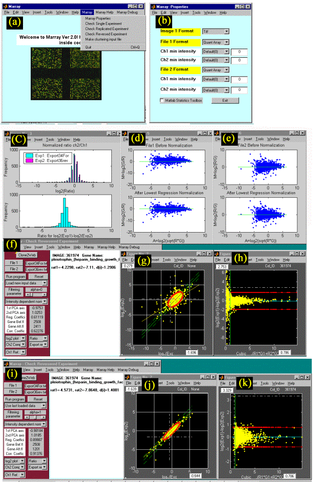
Figure
1. Screenshots of
MArray, showing the analysis of a pair of dye swapped microarray experiments
(One experiment where cDNA populations originating from two cell lines were
labelled with two different fluorochomes and co-hybridised on-to a 2880 human
gene microarray, was compared with one where the two cDNA were labelled with
the opposite fluorochomes): a) MArray main window; b) MArray
property window; c) Histogram plot of ratios; d, e) Log2-ratio
vs. overall intensity plot of experiment 1, 2; f,g,h) Before filtering
weak spots: MArray analysis window,
interactive scatter plot of ratios with a red-colored quality control ellipse
and simple statistical plot (difference between paired experiment vs. overall
mean intensity); i,j,k) After
filtering weak spots (signal-to-noise ratio <1): MArray analysis window,
interactive scatter plot of ratio and simple statistical plot. For more details
please see the text and the web site.